 QGO
Multilingual Customer Experience That Keeps Lines Moving
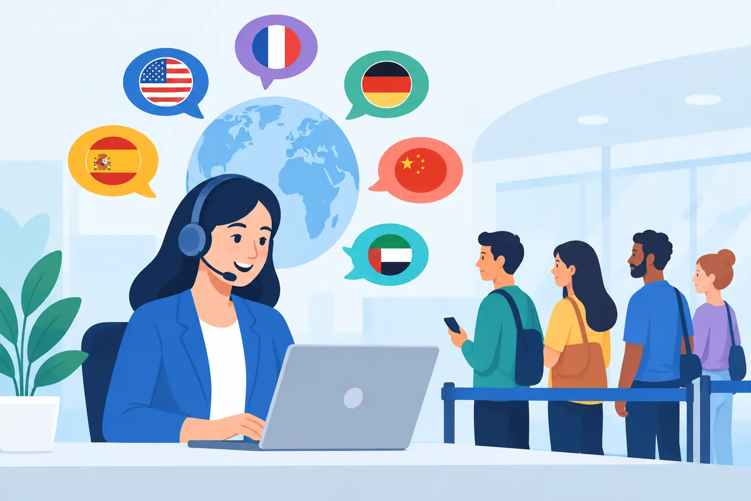
A customer walks up to your counter, sees a crowded line, and cannot understand the sign explaining where to wait. Your team tries to help while serving the people already in line. That is not a translation problem alone. It is a customer-flow problem. A strong multilingual customer experience makes the next step clear for every visitor before frustration has time to build.
For stores, clinics, restaurants, salons, service desks, and event venues, language affects more than a welcome message. It affects whether customers know how to join the queue, how long they may wait, and when it is their turn. Clear mobile updates can replace the uncertainty that creates crowded entrances, repeated questions, and staff interruptions.
Why multilingual customer experience affects the line
Visible lines create pressure fast. People want to know three things: Where do I go? What do I need to do? How long will this take? If the answer is only available in one language, some visitors have to guess, ask another customer, or wait at the counter for help.
That delay adds up. Staff members repeat instructions. Customers stand closer to the service area because they are afraid of missing their turn. A queue that should feel organized starts to look chaotic, even when the actual wait time is reasonable.
Multilingual communication reduces that uncertainty. When customers can read queue instructions and status updates in a familiar language, they can act independently. They join the line correctly, monitor their place from their phone, and return when called. Your team can spend more time serving and less time directing traffic.
This matters most in locations with diverse local communities, international visitors, tourists, students, or bilingual households. But it is useful anywhere. A visitor may speak English well enough for a purchase yet still prefer clear wait instructions in another language, especially when they are in a hurry or managing a family.
Start with the moments that cause confusion
You do not need to translate every piece of marketing copy to improve the in-store experience. Start with the moments where a customer must make a decision. In a queue setting, those moments are usually joining, waiting, receiving an update, and arriving for service.
Let customers choose a language early
Language selection should appear before the customer has to interpret instructions. If someone scans a queue code or opens your mobile queue page, make the language option easy to find. Do not bury it behind several screens or use tiny text that is hard to tap.
The goal is simple: customers should understand what they are joining before they submit their place in line. A familiar language builds confidence at the exact moment they decide whether to wait, leave, or ask for help.
For repeat visitors, remember the selected language when possible. That removes one more step from the next visit. One tap to join is better than a multi-screen setup, especially when a customer is standing outside a busy pickup area.
Translate operational messages, not just labels
A button labeled Join Queue is useful. But the messages after that button matter more. Customers need to understand their estimated wait, their position, what to bring to the counter, and whether they should stay nearby.
Keep these messages short. A long, formal explanation is harder to read on a phone and harder to translate accurately. Plain language works better: You are in line. Your wait is about 15 minutes. We will notify you when it is your turn.
Avoid wording that depends on local expressions or internal staff language. Terms such as will be up shortly or please hold tight may sound friendly, but they can create confusion across languages. Direct instructions are easier to understand and easier to translate consistently.
Keep the customer’s action obvious
Every queue message should answer a practical question. Do they need to check in? Can they shop while waiting? Should they return to a specific counter? If the answer changes by location or service type, say so clearly.
A customer who receives a notification but does not know where to go is still waiting. The digital queue has done only part of its job. Add a clear next action, such as Please return to the service desk or Show this screen at pickup. Keep it specific to the physical space.
Mobile-first access removes another barrier
Translation helps only if customers can access the experience without friction. Requiring a native app download can slow down a line, particularly for first-time visitors, tourists, or people with limited phone storage. Requiring a kiosk creates another physical bottleneck and another device for staff to manage.
A lightweight mobile queue experience gives customers a faster option. They can open the queue from their own phone, select their language, and monitor their status while they wait. No printed ticket to lose. No hardware station holding up the entrance. No account setup that turns a two-minute task into a longer one.
For customers who want quick access later, an installable web experience can sit on their home screen like an app. The steps should feel familiar: open the page, use the Share button, select Add to Home Screen, then tap Add. Done. The customer has a direct path back to the queue without another app-store download.
QGO supports 16 languages within a mobile-first queue experience, helping businesses serve more customers without adding a bank of kiosks or a complex onboarding process.
Consistency matters more than perfect word-for-word translation
The best multilingual customer experience is not always the one with the most translated pages. It is the one that uses consistent, understandable language at the right moments.
Literal translations can miss the point. A phrase may be technically correct but still feel unnatural or unclear to customers. Review the wording with people who actually speak the language and understand the local context. This is especially useful for service instructions, appointment terms, age requirements, and pickup policies.
You also need to account for differences in text length. A short English button may need far more space in another language. If the design cuts off a key instruction or makes the screen difficult to scan, the translation has not solved the problem. Test the full customer journey on a phone, not just the text in a spreadsheet.
There are trade-offs. Supporting more languages can require more review, more upkeep, and clearer internal ownership. If your locations have different customer bases, a single language set may not fit every market. Start with the languages customers use most often, then expand based on real demand rather than assumptions.
Give staff a simple role in the experience
Digital language support should reduce staff effort, not create a new training burden. Your team still needs to know how to assist a customer who has not joined the queue or cannot access a phone. But they should not need to translate every wait update by hand.
Give staff one short process for helping customers: point them to the mobile queue, show where to choose a language, and confirm what will happen next. A simple printed prompt near the entrance can help, but the primary experience should live on the customer’s device where updates are easy to see.
Staff-facing language should be just as clear. If an employee can see the queue status, they should understand what customers have been told and when they were notified. That keeps the handoff clean when a customer arrives at the counter.
Measure whether the experience is working
You do not need a complicated reporting project to spot improvement. Watch what happens on the floor. Are fewer people clustering around the counter? Are staff answering fewer questions about wait times? Are customers joining the queue without needing help?
Compare abandonment, average wait time, notification response, and repeat usage across locations or service types. If one location has a higher drop-off rate after customers open the queue page, check whether the language options, instructions, or physical signage are clear enough.
Customer feedback adds context. A short question after service can reveal whether people understood the process, not just whether they completed it. If customers say they did not know when to return, the fix may be a clearer notification rather than a shorter queue.
Language access is practical customer service. When every visitor can understand how to join, wait, and return, the line becomes less of a barrier and more of a predictable part of the visit. Start with the next action your customers need to take, make it easy to read on a phone, and let clarity do the work.
Give your customers a line they don't have to stand in
QGO turns any counter into a smart digital queue: customers scan a QR code, take a number on their own phone and get alerted when it is their turn. No app download, no hardware, 16 languages.
Try QGO free How it works