 QGO
How to Create a Mobile Waiting Experience
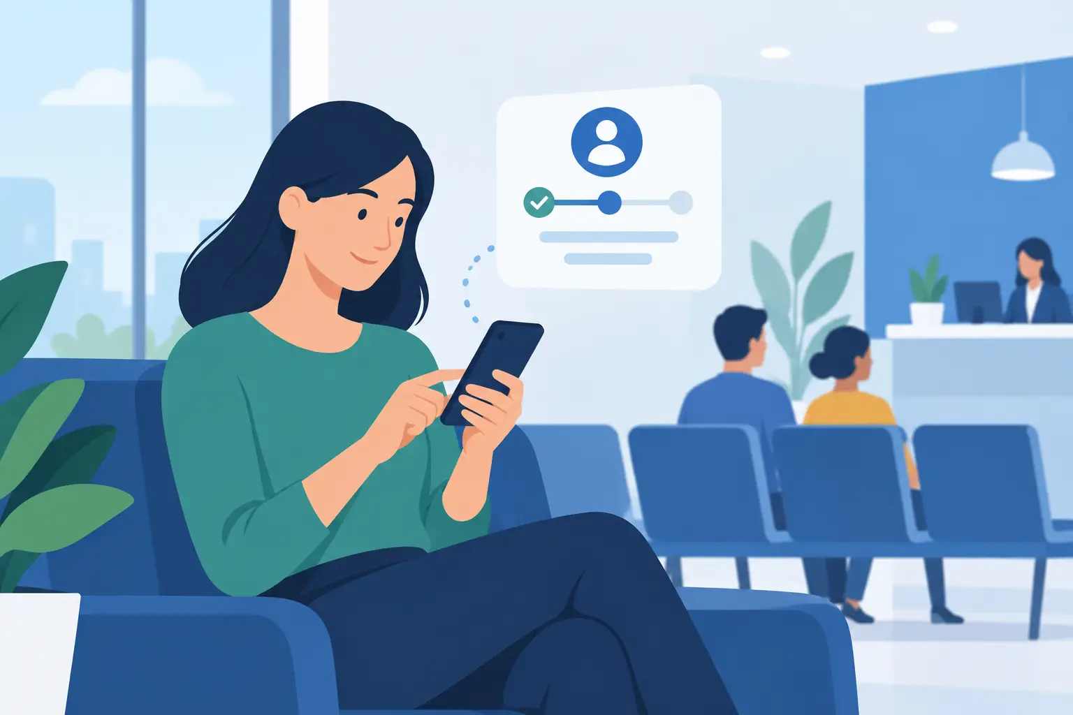
A line forming near the register does more than slow service. It makes your business look disorganized, raises the pressure on staff, and gives people a reason to leave before their turn arrives. To create a mobile waiting experience, move the queue from the floor to the customer’s phone - then make every step clear enough to use in seconds.
The goal is not to add another complicated system. It is to give customers a simple way to join, check their place, and return when it is time to be served. For your team, it means fewer questions about who is next and more attention on the work that actually needs to happen.
Start with the moment the line begins
A good digital queue starts where frustration usually starts: at the point a customer realizes they have to wait. That might be at a busy service counter, a restaurant host stand, a clinic check-in desk, a salon reception area, or a pickup window.
Put a clear entry point where people naturally pause. A simple sign can prompt customers to scan a code or use a short access route on their phone. The message should answer the immediate question: what do I do now?
Use direct language such as: “Join the waitlist,” “Check your place from your phone,” or “Scan to get in line.” Avoid explaining the technology before the customer has joined. They do not need a product tour. They need to know they can stop standing in line.
The first interaction should take less than a minute. If customers have to create a password, search an app store, or fill out a long form, you have recreated the friction of the physical line in a different format.
Make joining a queue feel like one tap
The best mobile waiting experience works in the browser and can be saved to a phone home screen when customers want faster access later. That gives people app-like convenience without asking them to download another native app.
For returning visitors, home-screen access matters. They can tap an icon, check their status, and move on. For first-time visitors, a lightweight web experience removes the usual adoption barrier: “I do not want to install an app for this.”
Keep the join flow focused on only the information your staff truly needs. In many settings, that is a name and a contact method. A restaurant may need party size. A clinic may need a visit type. A retail service desk may need the reason for the visit so the right team member can prepare.
Every added field has a cost. Ask for more only when it improves the service that follows. If a customer is joining a short pickup queue, a detailed intake form is unnecessary. If they are waiting for a technical consultation, a few extra details may reduce service time later. It depends on the interaction, not on what your system can collect.
Create a mobile waiting experience with useful updates
Joining digitally is only the first win. The real value comes from reducing uncertainty while customers wait.
A customer who knows they are third in line behaves differently from one who has no idea whether the wait is five minutes or forty. They can browse nearby products, sit down, order a coffee, finish another errand, or simply stop watching the counter. Your waiting area feels calmer because fewer people need to cluster around it.
Show a clear queue position, a realistic estimated wait, and a prompt when the customer is getting close. Do not treat estimated time as a promise if your service pace changes often. It is better to say “approximately 15 minutes” and update it than to display a countdown that feels exact but becomes wrong.
Updates should be practical, not noisy. A confirmation right after joining is essential. A near-turn alert is useful. A final “please return now” message closes the loop. Constant notifications can annoy customers, especially in longer queues.
Your wording matters here. “You’re next” can create confusion if staff still need a few minutes to finish the current service. “Please return to the service desk” is more specific. For pickup, say where to go. For a venue, name the entrance or desk. The phone should reduce questions, not create new ones.
Give staff a queue they can run at a glance
A customer-facing experience only works if the staff view is fast enough for a busy shift. Staff should be able to see who is waiting, who is next, how long each person has been waiting, and what kind of help they need.
This changes the conversation at the counter. Instead of repeatedly answering “Who’s next?” or trying to remember arrival order, your team can call the next customer with confidence. That is especially useful when the same team is handling walk-ins, appointments, phone calls, returns, and pickup requests at once.
Build a simple operating routine around the queue. Decide who checks people in, who advances the line, and who handles customers who do not return when called. The software can organize the flow, but clear ownership keeps the flow moving.
Do not overengineer this. Smaller teams may have one person managing the queue during peak periods. Larger locations may give each service area its own line. The right setup reflects how customers already move through your location.
Plan for no-shows and walk-ups
No-shows are normal. A customer may get delayed, leave, or miss an alert. Give staff an easy way to skip, recall, or remove a customer without disrupting everyone else in line.
Walk-ups need a clear path too. Some customers will not have a smartphone ready. Others may need accessibility support or prefer help from a team member. A mobile-first queue should reduce the physical line, not exclude people from service.
Staff can add a walk-up customer to the same digital queue when needed. That keeps one source of truth for the order of service, even when not every customer joins independently.
Replace hardware costs with simple access
Traditional ticket systems create their own operational burden. Kiosks need space, power, maintenance, supplies, cleaning, and occasional troubleshooting. Printed tickets run out. Screens fail. A physical device can also become a new gathering point, which does little to reduce congestion.
A phone-based queue shifts access to the device customers already carry. There is less equipment to install and less hardware to maintain across locations. For operators opening a new site or testing a new service model, that can make deployment much faster.
This is not an argument that physical signage disappears. It becomes more important. A small, well-placed sign gives customers the cue they need to join. The difference is that the sign starts the experience instead of becoming the experience.
QGO is built around this low-friction model: customers join from their phones, monitor their wait, and can save access to their home screens without a conventional app download or dedicated queue hardware.
Design for the customers you actually serve
A queue is not only an operational tool. It is part of your customer experience, so the language and setup should match your audience.
If your location serves multilingual communities, offer the queue experience in the languages customers use. A customer should not have to ask for help simply to understand how to join a line. Clear, familiar instructions lower stress for customers and reduce repetitive explanations for staff.
Also consider the context of the wait. At a clinic, privacy and clear arrival instructions matter. At a restaurant, party size and table readiness matter. At a retail counter, the customer may want to keep shopping until called. At an event venue, you may need to guide people to a specific entrance quickly.
One queue format does not fit every location. Start with one high-friction point, learn how customers use it, and adjust the prompts, fields, and notifications based on real behavior.
Measure whether the wait feels better
A shorter line on the floor is a visible success, but it is not the only measure. Watch for fewer customer questions, fewer abandoned waits, faster check-ins, and less staff time spent manually organizing people.
Ask staff what happens during rush periods. Are customers returning promptly when called? Are the estimates realistic? Are people still lining up because they missed the sign? These answers point to practical improvements, often in signage or wording rather than in the queue setup itself.
Give the new flow enough time to become familiar. Customers may need a few visits before joining from their phone feels automatic. Keep the instruction visible, keep the steps short, and let the experience prove its value one calm service interaction at a time.
The best waiting experience does not ask customers to think about waiting at all. It gives them their place, gives them a clear next step, and gives them back the freedom to use their time.
Give your customers a line they don't have to stand in
QGO turns any counter into a smart digital queue: customers scan a QR code, take a number on their own phone and get alerted when it is their turn. No app download, no hardware, 16 languages.
Try QGO free How it works